Showing posts with label Narrative Structures. Show all posts

Thursday, 25 August 2022

Part 13: 'Grey Waters' interview with Artist and Educator, Geoff Grandfield - The L.A.W. GraphicNarrativ Seminar Series

You can now see my interview with Geoff Grandfield as he discusses his new silent graphic novel, Grey Waters on YouTube here


Geoff Grandfield Interview for Silent Graphic Novel GREY WATERS

The Seminar Series continued over the summer as I design the new lectures that I will deliver from this October. I have a new survey for practitioners to contribute and ambitions to take things beyond the teaching studios of the London College of Communication.

I had the opportunity to interview artist/ illustrator/ associate professor illustration and animation at Kingston University, Geoff Grandfield about his silent graphic novel 'Grey Waters' in August 2022. 10 questions were sent to Geoff initially and then we built upon these for the video recorded interview version.

Here is a taster of the interview that was recorded as a video for publication at a later date.

Enjoy.


Q1. What are the reasons behind you creating a silent graphic novel?


It seems right? I’m following instinct. The way the form appeals is as a series of images that are direct and active, as they offer something. As a viewer you decide on the pace of the reading and how you see it. I spent a lot of time exploring how individual frames are experienced in relation to the whole of a page and as a double page spread, trying to find a way that one didn’t distract from the other and allowed a simultaneous reading.

My only previous foray into GN was a treatment of Fast One by Paul ‘Cain’ (alias for screenwriter Paul Ruric) where I used painted frames and stuck on dialog, it wasn’t printed how I designed it and am producing a new digital version this year. The collision of image and text had some interesting moments, but by writing in images I hoped to open up the movement across pages with minimal intervention of words.


Q2. Where does the title 'Grey Waters' come from?


I tried a number of options but wanted something emblematic of the content. As the story is about real events, their recall and speculation, the title could have got a bit cryptic!

The title chosen has a dual role as a composite of the slightly adapted name of the real life character I based the work on and brain function / memory, like being submerged in ‘grey matter’.


Q3. Do you consider yourself a writer or an artist?


Writing in pictures? My work has explored intangibles through making pictures, individually and in series. I like the word illustrator! Though ‘illustration’ has cultural ambiguity, and is mostly culturally dismissed, I think that disregard works for how I use it as a means to understand self and the world without critical expectation.


Q4. What are your thoughts on image as literature?


Fine if that helps reach audiences. We talk about reading pictures but what I love about a good picture is the lack of linear reading and potential for surface or deep reading.


Q5. Why do you think that TRUTH has become such a mercurial thing during the 21st century?


The persistence of centuries old monolithic cultures that had their economic power base in printed authority have cracked up with the economic restructuring from digital technology. With it the construction of ‘truth’ guarded by dominant cultures. So truth is now transparently subjective?


Q6. Who is responsible for telling the TRUTH?


The artist, which is anyone who wants to be true to themselves! I think I mean that by spending some time and effort realising what you want, as opposed to what others want you to have/ do/ possibly think, you gain understanding of yourself that is not mediated by others and in the process make something that is meaningful to you. The chances are this may be meaningful to others too if you decide to share with an audience. So I suppose I am equating truth, which I think is always subjective, with true instincts and living in a way that is positive? Sometimes a person that practices that is called an artist, but it is a very overused and loosely fitting word! A bit like truth!


Q7. How do you keep your ideas fresh when so much of our visual world is controlled by large corporations?


Try and find your own voice, art college is a good start. Well this is subjective, from my point of view, but hopefully relates to a lot of creative practice. By making the investment of time/ thought/ play/ making and reflection, then what is meaningful to you may emerge. It’s a long process as the hooks are sunk in deep even by the time you’re an adolescent, the desire to be part of something can be a trade in of what you really want – I think I’m still answering the previous question!


Fresh means different? Try new things, new to you or you haven’t seen explored? I never really got too excited by lots of media mixing as I found it distracting from what I wanted to make art about, so I found the most direct lo-tech chalk on paper and still use this now.


Q8. Do you think this is stifling our imaginations?


Most people unfortunately don’t realise they are being stifled/ manipulated on what to think or see, they feel they make choices. It sounds like conspiracy because it has over 100 years of psychological testing behind corporate strategy but not easy to spot.


Q9. In a world filled with electronic media do you think that the traditional book has had its day, or will we always need books?


Always need communication tools in the hands of thinking makers! That is books and everything else. I am a big fan of a the lo-tech approach, DIY! The best visual authorship leads I think, so don’t wait to be commissioned to make something, do something you want to see and show it, this can lead to positive response and getting your work to an audience. Too much commissioning comes from the ‘I want one of those’ approach and dissatisfaction if it doesn’t match, make what you really want to see and hopefully you won’t get bent out of shape by what the commissioner wants!


Q10. What are you working on now/ next?


Actually starting a research enquiry into the ‘visualisation of absence’. There’s a graphic novel in that too!


Acknowledgements

Thank you very much for this Geoff, it's been a pleasure and I look forwarded to seeing your work published. I think my students will benefit greatly from your insights. Let's build on this collaboration. For more work check out Geoff Grandfield's website. 

All artworks are copyright of Geoff Grandfield © 2022


Look out for the video of this interview to be published in September 2022.


Proposition Time Part 8

Create 6 illustrations/ images/ ideas as a sequential narrative inspired by the text set out below:


Free you mind and use this exercise as a way to re-imagine your work.

Outside the rain begins
And it may never end
So cry no more, on the shore a dream
Will take us out to sea
Forevermore, forevermore 

Close your eyes ami
And you can be with me
'Neath the waves, through the caves of hours
Gone, forgotten now
We're all alone, we're all alone 

Close the window, calm the light
And it will be all right
No need to bother now
Let it out, let it all begin
Learn how to pretend 

Once a story's told
It can't help but grow old
Roses do, lovers too, so cast
Your seasons to the wind
And hold me dear, oh, hold me dear 

Close the window, calm the light
And it will be all right
No need to bother now
Let it out, let it all begin
All's forgotten now
We're all alone, all alone 

Close the window, calm the light
And it will be all right
No need to bother now
Let it out, let it all begin
Owe it to the wind, my love, hold me dear 

All's forgotten now, my love
We're all alone


Sunday, 6 March 2022

Part 3: Gods and Monsters - The L.A.W. GraphicNarrativ Seminar Series


During the 3rd lecture of the series we looked at the following sources of inspiration and storytelling devices:

Ed Brubaker and Sean Phillips creative collaborations go back more than 20 years and they have produced some impressive work from Criminal to The Fade Out. We looked through examples of their work on the comic book series 'Fatale' and 'Kill Or Be Killed.'

These publications come out of Image Comics which is a publishing company formed by creative people for creative people to promote creative-owned projects that are meant to be superior to work for hire projects.

Fatale was coloured by Dave Stewart

Kill Or Be Killed was coloured by Elizabeth Breitweiser


The lecture slides are shown below
 that covered the main points of the works under discussion; Fatale (2012-2014) and Kill Or Be Killed (2016-2018).


Fatale is a creative blend of noir and horror that leads the characters down dark paths to even darker fates. We feel compelled to continue reading in the hope of finding the clues to help us understand this mystery.


We are introduced to a ‘woman’ (Eve combined with Jezebel) who's been on the run since 1935. We discover her living unchanged in 2012 through a troubled reporter who after tracking her down, unleashes forces he can scarcely imagine. The story is full of problems as the ‘male gaze’ has been turned up all the way to 11. Is the woman a Siren, a Harpy or an Angel? We see doomed men from all walks of life who've been caught the web over the decades-long struggle between the ‘woman’ and a mobster monster. The mobster monster is after the ‘woman’ and he has an army of goons and acolytes to help in this pursuit. Can anyone be trusted? Most definitely not!


Ed Brubaker draws you into their insane motives, making you think about the why, before ripping everything apart right before your eyes. The illustrations by Sean Phillips strike a marvellous balance between graphic representation and the subtle evocations of the things that are normally unseen by the uninitiated. As the story proceeds we are exposed to bleak Lovecraftian tentacled beings, sacrificial rites and corrupted flesh.

The creative team behind Fatale have managed to combine the different genres seamlessly to forge a fresh and original retelling of its pulp fiction inspirations. They continued to use the genre mash up technique in their subsequent output.


Kill Or Be Killed is a dark take on the vigilante genre that became a cracked reflection of the world around us. Grad student Dylan makes a major error in his life due to his depression. His world is rocked by the sight of the demon. Is it real or is it part of his depression?


When he is forced to kill in order to stay alive, he decides that he can only execute those who ‘deserve’ it. As the months go by, he gets drawn deeper into the complexities and contradictions of his Vigilante lifestyle. Just how many people out there really ‘deserve’ it and is he really an Avenging Angel or a madman? Part existentialist parody, part Death Wish on Prozac, Kill Or Be Killed pays homage to the artists and illustrators whose vintage work inspired our creative team to write and draw comics in the first place.  


It is a direct response to the creators feeling that there is no justice in the world. Walking down those mean streets, those boulevards of broken dreams you begin sense that Dylan might be the only sane person in a world gone soft. His actions might actually be on the side of right. Convincing you to empathise with a cold-blooded killer is the reason that the book works. Naturally we are conditioned to hate it when bad people get away with it and we might fantasise about taking justice into our own hands. For us Dylan is doing what is right and we want him
to get away with it even though he shouldn’t.

Selected images for Kill Or Be Killed

References

Brubaker, E. and Phillips, S. (2015a) Criminal. Berkeley, CA: Image Comics, Inc.

Brubaker, E. and Phillips, S. (2015b) The fade out. Image Comics.

Brubaker, E. and Phillips, S. (2015c) Fatale. Berkeley, CA: Image Comics.

Brubaker, E., Phillips, S. and Breitweiser, E. (2017) Kill or be killed. Bielefeld: Splitter Verlag.

Brubaker, E., Phillips, S. and Phillips, J. (2022) Cruel summer. Portland, Oregon: Image Comics.

Brubaker, E., Phillips, S. and Phillips, J. (2021) Pulp. Portland, OR: Image Comics.


Proposition Time Part 3 

A WRITING EXERCISE
Genre Mash Ups suggested by the participants (students of Illustration and Visual Media) that were arrived at post lecture. Can you construct a new storyline by combining at least six of the Genres set out below?

A Genre is by definition: 
a style or category of art, music, or literature. "the spy thriller is a very masculine genre."

1. Rites of passage

2. Science Fiction

3. Detective story

4. Fairytale

5. Comedy

6. Fantasy

7. Romance

8.Crime story

9. Time Travel

10. High Finance

11. The Peace Treaty

What can you make out of combining the following selection? Can you write a 300 word summary about this new genre mash up? You should be trying to produce something that is original that you haven't tried to write before.

MY EXAMPLE OF THIS PROCESS
A rites of passage story that uses the detective process and comedy to explain high finance when it is combined with time travel and romance.

You hopefully get the idea and of course can develop ideas and a storyline using any combination from my list above. Have fun!


Thursday, 6 August 2020

The Garden of Inside-Outside

Written by Chiara Mezzalama


Illustrated by Régis Lejonc


ISBN 978-1-911496-16-8


Published by Book Island


Reviewed by Karl Andy Foster


Publisher’s website https://www.bookisland.co.uk/products/the-garden-of-inside-outside?_pos=1&_sid=bf411036a&_ss=r


Illustrator’s website https://www.ricochet-jeunes.org/auteurs/regis-lejonc


Review


This is a story that sets out its context carefully as the events that surround and impact upon our young protagonist Chiara requires sensitive handling. A memoir framed against a turbulent period in the history of the middle east evokes the author’s remembrances of things past.


With similarities to a propaganda poster the cover of this graphic novel shows two children linking hands in a beautiful garden. Above their heads and outside the inside is the image of the Ayatollah Khamenei in ominous red and black. The paper stock also adds to this quality. On some pages there is not the conventual linear story but instead images that could be self-contained and work in their own right.


Throughout the story at the top of the pages we see either the word OUTSIDE in red to indicate danger or INSIDE in green for the more peaceful moments. Towards the end both OUTSIDE and INSIDE are shown together once another child Massoud enters the garden. Through their interactions the children process the realities of the world outside. They shape their fears into adventures and shared values into friendship.


The illustrations in this book remind me of linocuts or wood block printing. The limited palette of green, blue, red, yellow with black outlines helps to reinforce this impression. From arches to decorative tile work, from illustrated carpets to lush vegetation gone wild the line work is fluid and flows well. The drawing style is a combination of the powerful details found in David B.’s work and the graphic boldness of Marjane Satrapi’s illustrations.


This is a delightful story about friendship in unusual circumstances. Based on the biographical events of the author’s life and set during a time of revolution and war, it is the precious moments that cement our personalities and create the myths of our early years. At the end of this story there is a moment that reminds me of a line from A. E. Housman’s ‘A Shropshire Lad.’


“That is the land of lost content, I see it shining plain,

The happy highways where I went

And cannot come again.”


This graphic novel is proof that it is necessary to relive your past and to share this with others.


9th March 2020


Small In The City

Written & Illustrated by Sydney Smith


ISBN: 978-1-4063-8840-4


Published by Walker Books


Reviewed by Karl Andy Foster


Publishers website http://www.walker.co.uk/Small-in-the-City-9781406388404.aspx


Sydney Smith https://www.sydneydraws.ca


Pitch

This is something special. Sydney Smith’s narrative power is his ability to immerse the reader into the world and concerns of a small child. His spare economical prose and exquisite artwork propels you towards a startling destination. This is an honest and credible story that after drawing you in leaves you satisfied, perhaps with one or two tears in your eyes.


Review

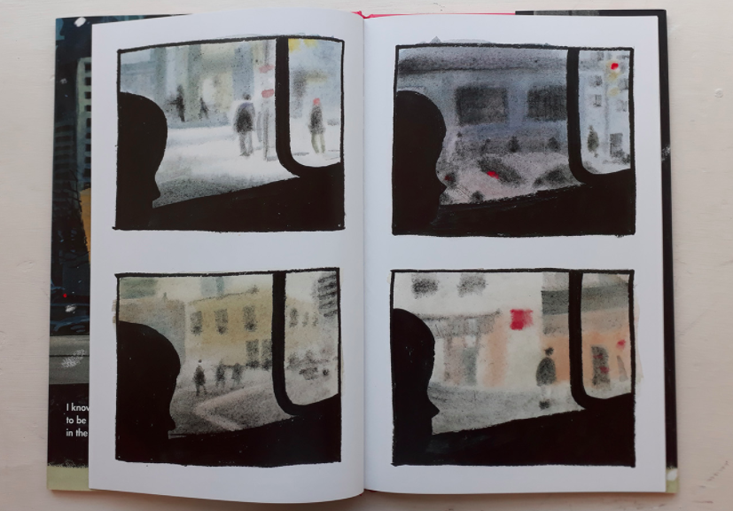
In this hard cover picture book there are some lovely observations visual and textual. The initial four panels with the silhouettes and blurred streets convey the sense of unease. A child roams around the city encountering a range of scenarios and offers advice that may or may not be of comfort to a stranger.


Sydney Smith’s carefully constructed pages are a mixture of full spreads and panels. Of note is the double page spread when the child leaves the bus and makes their way into the throng of the crowds. In addition, the words “I know what it’s like to be small in the city” or “The streets are always busy. It can make your brain feel like there’s too much stuff in it.” I particularly enjoyed “Alleys can be good shortcuts. But don’t go down this alley it’s too dark.” We are completely involved with the concerns of our young protagonist.


The grid lines of buildings, walk ways and street furniture create a web suggesting a trap for the uninitiated. There is a stunning picture of the child’s reflection fractured by the arrangements of the mirror tiles on a building façade. We soon realise that this advice is not aimed at the reader but at something far more important. The revelation at the end of the picture book came as a surprise for me but I did start to get an inkling of what was to come.


Sydney Smith has created a classic that will make a big impression on readers with a story that though simple is imbued with a graphic fluidity combined with a visual dexterity that few can match. This for me is reminiscent of Ezra Jack Keats’ atmospheric The Snowy Day when I read it for the first time. The artwork nods in a knowing direction towards Dave McKean’s ‘Cages’ and ‘The Savage.’ The use of a subtle and sophisticated palette suffused with interpretive impressionistic inky marks and charcoal lines is thrilling.


If this picture book and his 2017 Kate Greenaway Medal winning collaboration ‘Town Is by the Sea’ written by Joanne Schwartz is anything to go by Sydney Smith is on his way to great significance. When you are small in the city you can still have the biggest heart of all.


08 October 2019


Greta and the Giants

Written by Zoë Tucker


Illustrated by Zoe Persico


ISBN: 978-0-7112-5375-9


Published by Frances Lincoln Children’s Books


Reviewed by Karl Andy Foster


Publishers website https://www.quartoknows.com/books/9780711253773/Greta-and-the-Giants.html?direct=1


Zoe Persico website http://www.zoepersico.com


Review


Greta Thunberg is a 17-year-old, Swedish school child who has become famous through her stand to save the world, beginning when she was 15 years old outside the Swedish Parliament one Friday afternoon. I have written reviews for stories about living people before and it’s usually a real-life account that has been adapted to help craft the story into a cohesive narrative. This time a real person has been cast in a fictional tale to help children grasp the concept of activism.


The cover is like a poster for a classic Western movie where our heroine stands legs apart ready for the final showdown with an unknown foe. Her face is stony in its resolve but her weapon is a large placard stating “Strike for Climate.” In the background are two silhouetted figures, could these be the Giants mentioned in the books title? The production of this book using UK based suppliers and printers align with its ethical stance. Greenpeace is a beneficiary of the sales of this book.


Zoë Tucker has framed this story of defiance into a magical fable in the mold of Hans Christian Anderson or a Charles Kingsley creation. Children take on the adult world because they have to in this story. In such cases of adversity, we need the children to ask themselves if it’s possible to inspire by your words and actions and can they see themselves as capable of making a difference to the world. Greta has spoken truth to power across the globe and has as many fans as detractors, therefore she must be doing something right.


Zoe Perisco’s illustrations are bold, sophisticated, loose, dynamic using subtle tones of yellow, purple, brown, sage and hooker green. The figuration of the giants helps us to appreciate that they are engaged in their lives without much thought for the impact their desires are having on the planet. There are striking spreads in the book e.g. the city consuming the forest, the children marching, placards in hands and the resolution images showing us what the world could be like if we all acted to save it. The three circular vignettes towards the end of the story are rather ambiguous despite the text underneath them. The text refers to the behaviour of the Giants after Greta confronts them but the images look more like the children characters who are doing the protesting. I do wonder if an error has been made here.


We want our children to be the future but it is a complex matter these days. What will happen? Will the real Giants think about changing the world or is this an impossible future? Can children convince adult readers to engage with change to make a difference? Out of small acorns mighty oaks spring forth.


21 February 2020


Friday, 20 July 2018

My Book Review for The Last Wolf by Mini Grey

The Last Wolf

Written and Illustrated by Mini Grey

ISBN: 978-0-857-55092-7

Published by Penguin Random House UK

Reviewed by Karl Andy Foster


Author website http://minigrey.com

Review

When I was a young boy, many decades ago I would collect my necessary items (stones, catapult, bubble gum and a bottle of pop) and go out first thing to explore the woods behind our house. The first page of this story took me right back to those carefree times when one did indeed hope to find wild animals.

Mini Grey has taken on Little Red Riding Hood, absorbed the story and repurposed the plot so it is more relevant for our present troubling times. She understands the reason for fables. All the characters are well defined and we care about them. Wolf, Lynx and Bear are fully realized charming creatures. The story has an ecological and conservation message that needs to be understood and acted upon.

The direct and graphic cover shows Little Red framed by a triangle and attired for adventure standing in the wood. Above her is the elegiac title, The Last Wolf. The end papers with their spikey green trees signal a fairytale within and this is so. We read a story within a story and flashbacks that are portents of the future. The serif text is crisp, informative and works mainly as captions. 

The sense of place and depth is evident in the paintings. The stand out spreads for me are when Little Red wanders deeper into the forest, when she enters the wolf’s tree cave, the flashback to the heyday of the forest and when the forest is surrounded by the houses. The visual storytelling doesn’t shy away from the realities of a polluted world and nature in crisis.

The split panel spreads work well with funny reveals at the start moving onto the flashbacks to the good old days in the middle and finally showing our impact on the natural world. Like her earlier work the illustrations have a spikey energy. Grey draws animals and trees exquisitely. She has great control over her line work and her autumnal colour palette. Yellows glow and blues show a cold encroaching civilisation. 

It is quite possible that The Last Wolfhas all the hallmarks to become a classic text. A previous winner of the Kate Greenaway Medal in 2007, Grey shows us the world as it is and how it might be. Our imaginations should be the only limitation for children and adults alike because we do need to identify solutions to these complex problems. I believe that for young children this book is a great place to start. 


17 July 2018